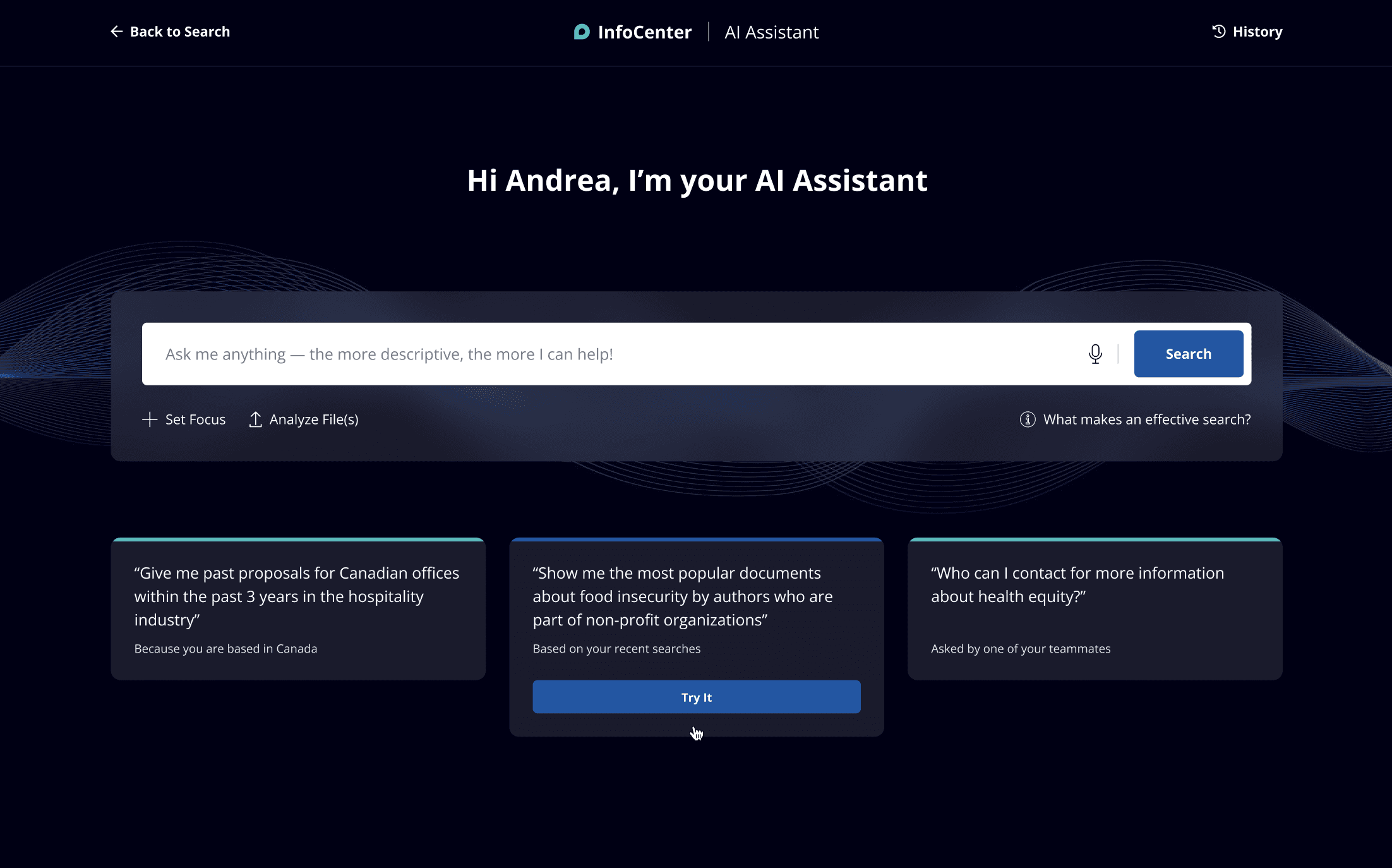
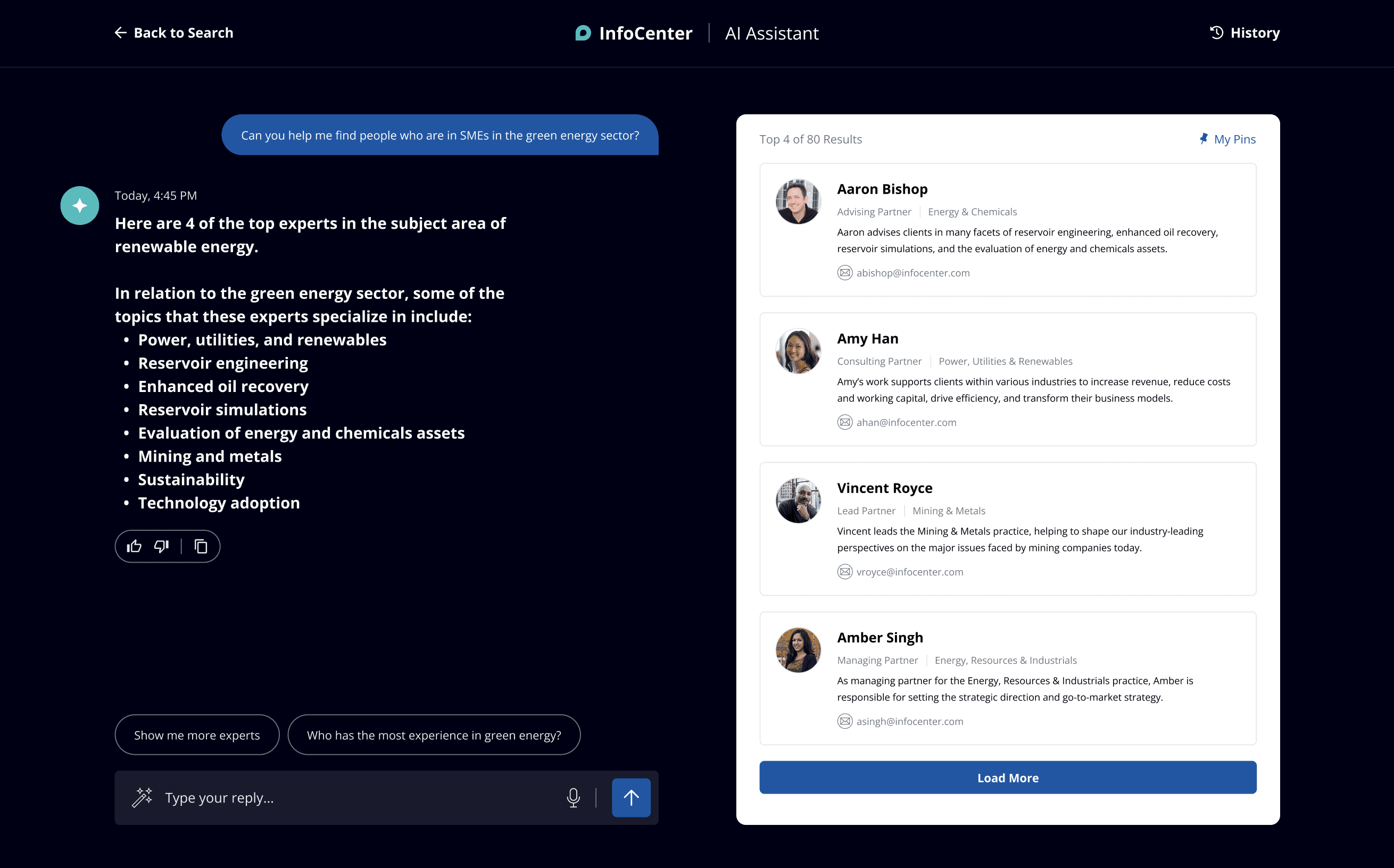
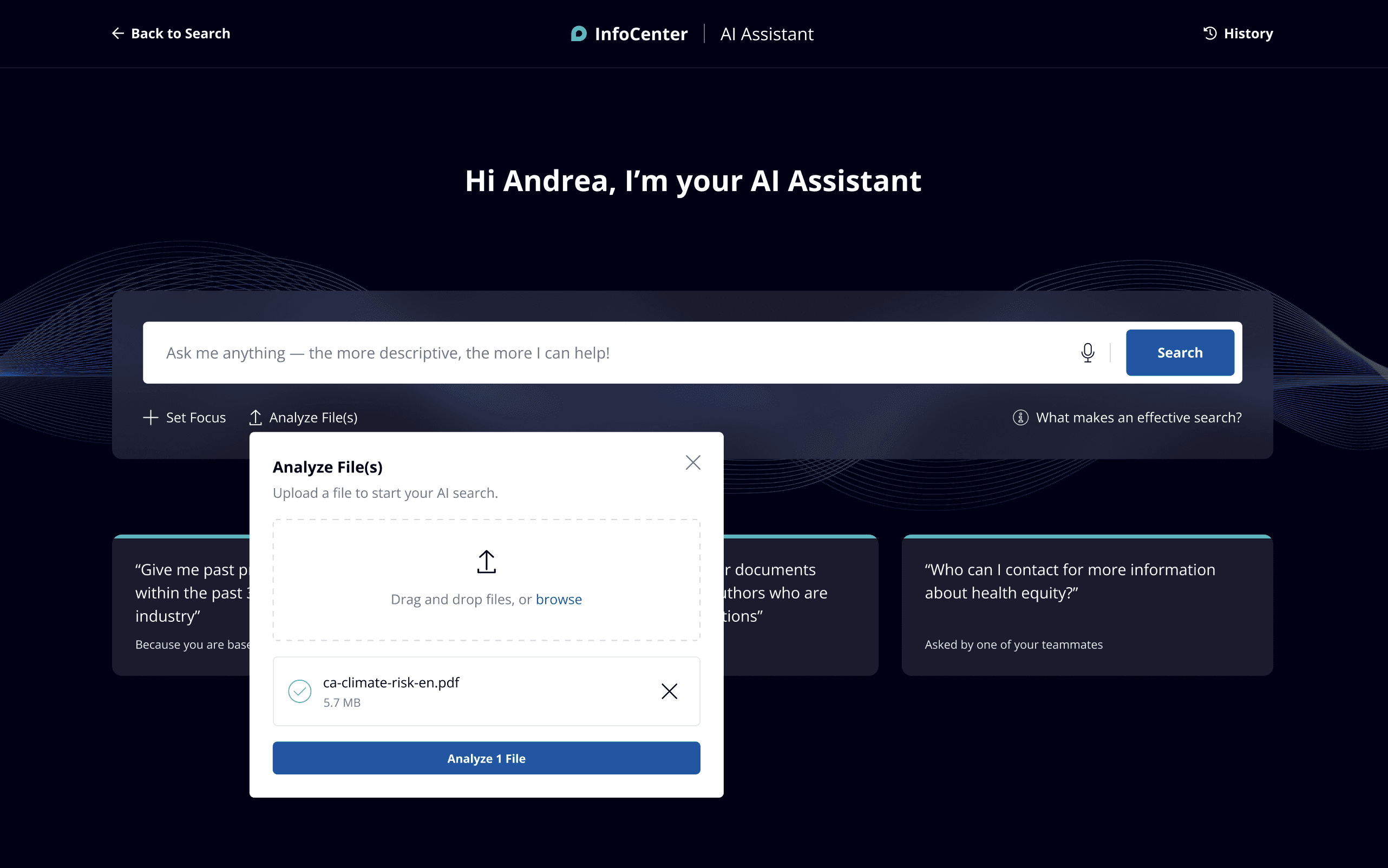
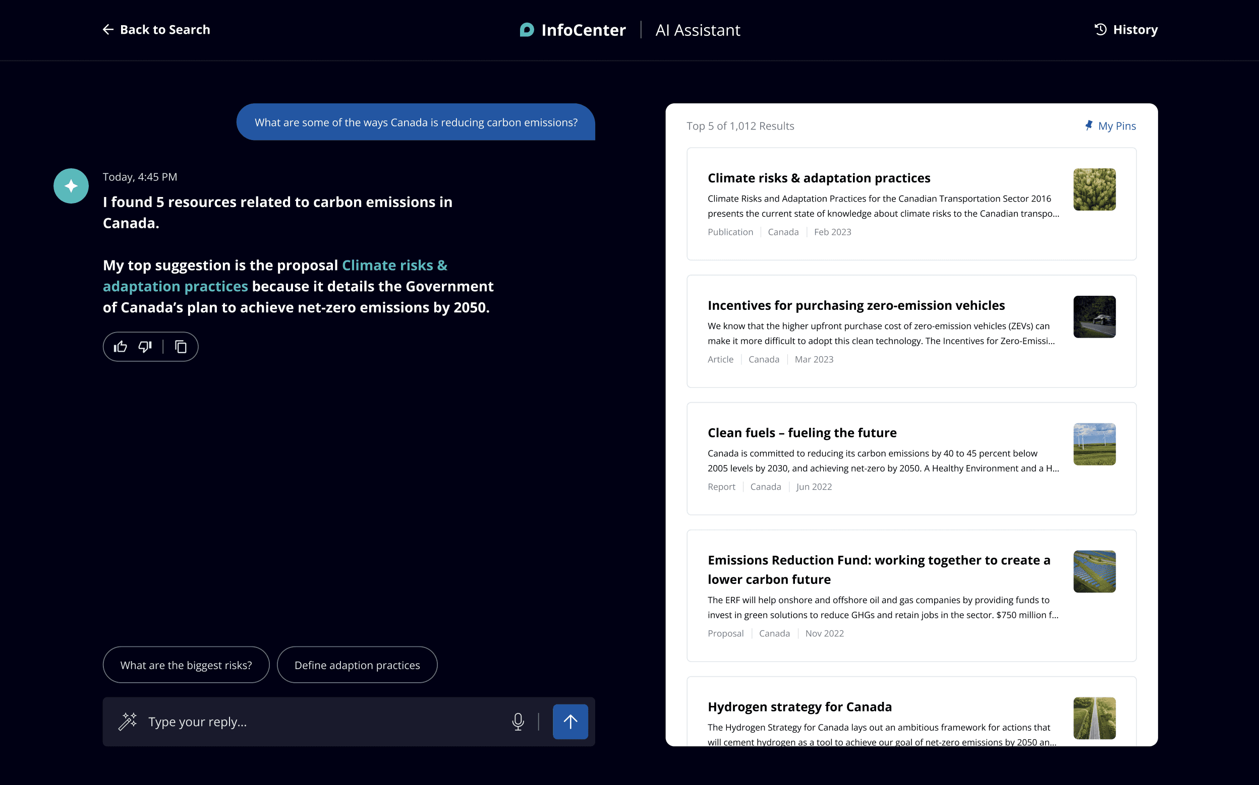
As an Associate User Experience Designer at Konrad Group, I spearheaded a transformative UX design initiative for Deloitte's knowledge management system, known internally as KX. Working with a cross-functional team, I conducted comprehensive user research that identified critical pain points affecting hundreds of thousands of professionals across 150+ countries who relied on this system daily.
Our research uncovered several interconnected challenges that severely limited knowledge discovery and utilization:
Search relevance issues
Users struggled to find relevant content due to poor matching algorithms, resulting in irrelevant or overwhelming search results.
Feature discoverability barriers
Complex functionality remained unused as users were unaware of powerful features that could enhance their workflows.
Content quality concerns
Resources were often outdated, lacked context, or didn't meet the specific needs of different user segments.
Inefficient filtering mechanisms
The existing system made refining search results cumbersome, forcing users to invest significant time finding relevant information.
Comparison difficulties
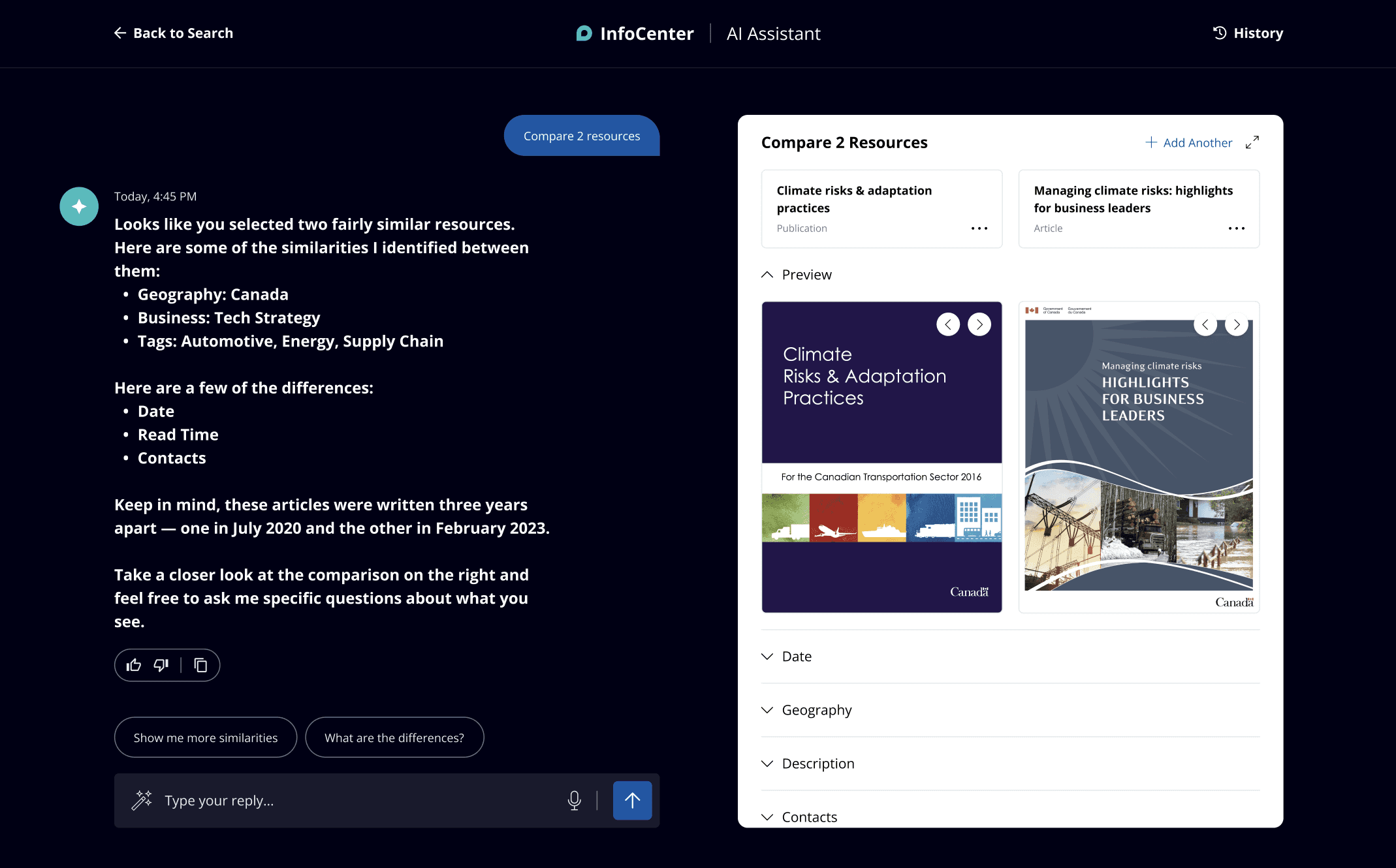
Users needed to open multiple windows and manually compare resources, creating workflow friction.
These challenges collectively resulted in significant productivity losses across the organization, with professionals resorting to workarounds or abandoning the system entirely in favor of personal networks or alternative knowledge sources.
Design Innovation: The InfoCenter AI Assistant
Based on our extensive user research, I designed a comprehensive AI-assisted search experience that fundamentally reimagined how professionals interact with organizational knowledge. Rather than simply applying cosmetic changes, our solution addressed the underlying information architecture and interaction patterns that were causing friction.
The core of our innovation was an intelligent assistant that balanced automation with augmentation, enhancing user capabilities without removing their agency in the search process.
Dual-Model Chatbot Architecture
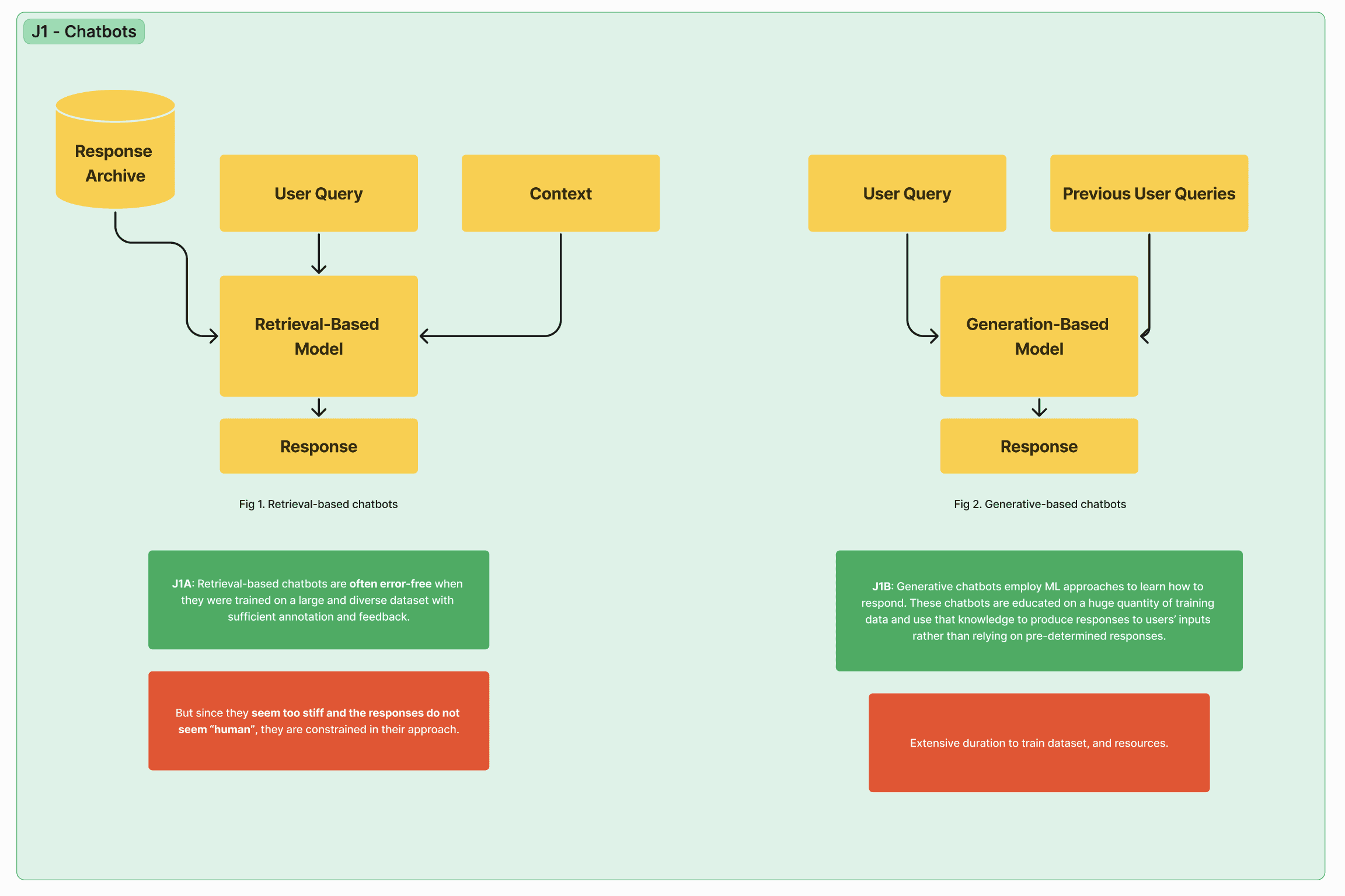
I designed a hybrid chatbot system that leveraged both retrieval-based and generative AI approaches:
Retrieval-based model
Pulling from a curated response archive to ensure accuracy and consistency for common queries.
Generative model
Creating contextual, personalized responses for complex questions while maintaining natural conversation flow.
This dual approach ensured both reliability and flexibility, addressing user concerns about AI accuracy while still providing the conversational experience they desired.
Precision & Recall Optimization
My design incorporated sophisticated relevance controls that allowed the system to balance precision (showing only highly relevant results) with recall (ensuring comprehensive coverage). This approach directly addressed the primary user frustration of either too many irrelevant results or missing critical information.
I included visual confidence indicators for search results, helping users understand why certain resources were presented and building appropriate trust in the system's recommendations.
User-Centric Search Controls
Rather than forcing users into rigid search patterns, I designed an interface that empowered them with granular control over their information discovery:
Advanced filtering
Context-aware filters that dynamically adjusted based on content categories and user history.
Customizable sorting
Multiple organization options including relevance, date, popularity, and personalized recommendations.
Comparison tools
Side-by-side resource evaluation without requiring multiple windows or downloads.
Query modification
Intelligent suggestions for refining searches based on available content.
Educational Design Artifacts
As part of my comprehensive approach, I created a series of educational design artifacts that documented key AI and UX principles relevant to the project. They served as alignment tools for stakeholders and as educational resources for the broader design team. Each one is below, with what it argues and why it mattered.
J1 · Chatbot Architecture Comparison
J1 lays the two chatbot pipelines side by side. The retrieval-based model draws every answer from a curated response archive, which keeps it predictable, consistent, and safe for the compliance-heavy content a professional services firm runs on. The generative model assembles responses from the user's query, context, and previous conversation, which is what makes open-ended questions feel natural. Mapping both flows in one picture gave the team a shared vocabulary for the hybrid design: retrieval where the answer must be exact, generation where the question is exploratory.
J2 · User Needs Framework
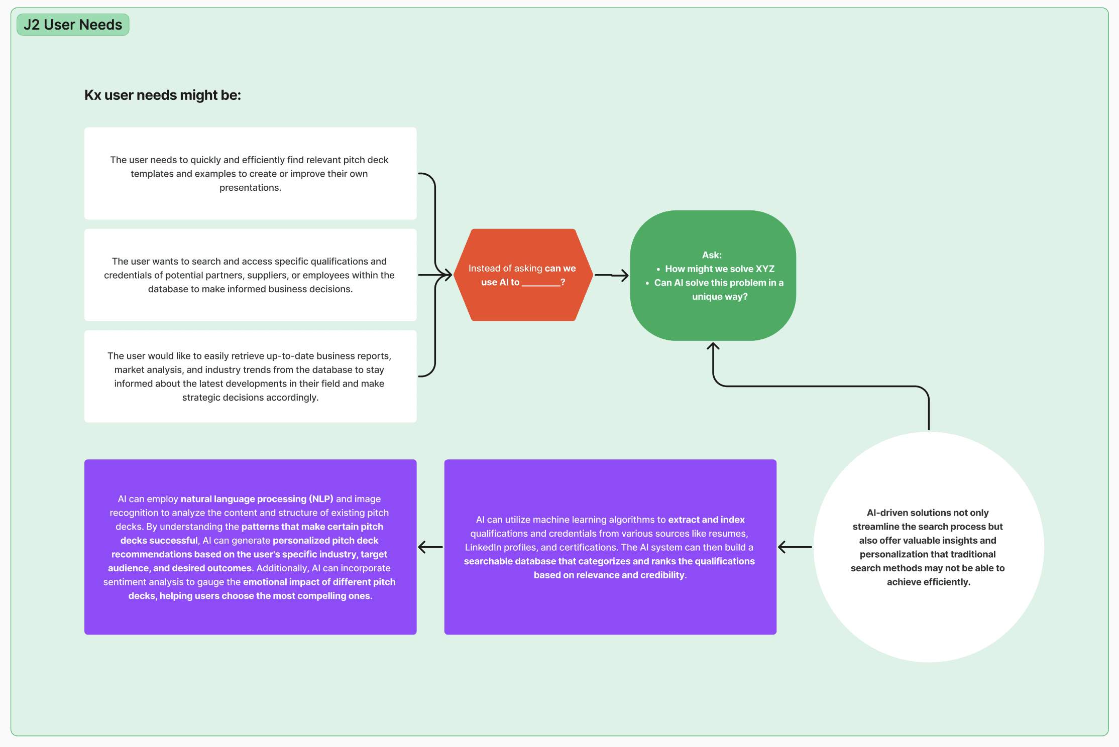
J2 reframes how AI enters the conversation. Instead of starting from “can we use AI to do this?”, it starts from real KX user needs, like finding proven pitch decks, verifying qualifications and credentials, and pulling current market analysis, then asks how we might solve each one, and whether AI can solve it in a unique way. Every need is then mapped to a concrete capability: NLP analyzing the structure of successful decks, machine learning extracting and ranking credentials into a searchable index. It kept the technology in service of the need, never the reverse.
J3 · Automation vs. Augmentation
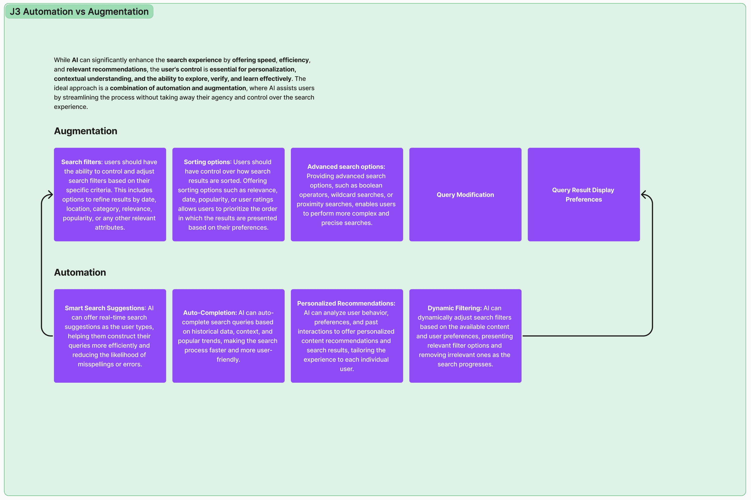
J3 draws the line between what the system should do for users and what it should help them do. The augmentation lane preserves agency: filters, sorting, advanced search operators, query modification, display preferences. The automation lane removes friction: smart suggestions as you type, auto-completion, personalized recommendations, dynamic filtering. The two run as a loop rather than a ladder, where every automated assist feeds back into controls the user can still steer, and that balance became the core interaction principle of the InfoCenter.
J4 · Binary Classifiers in Search
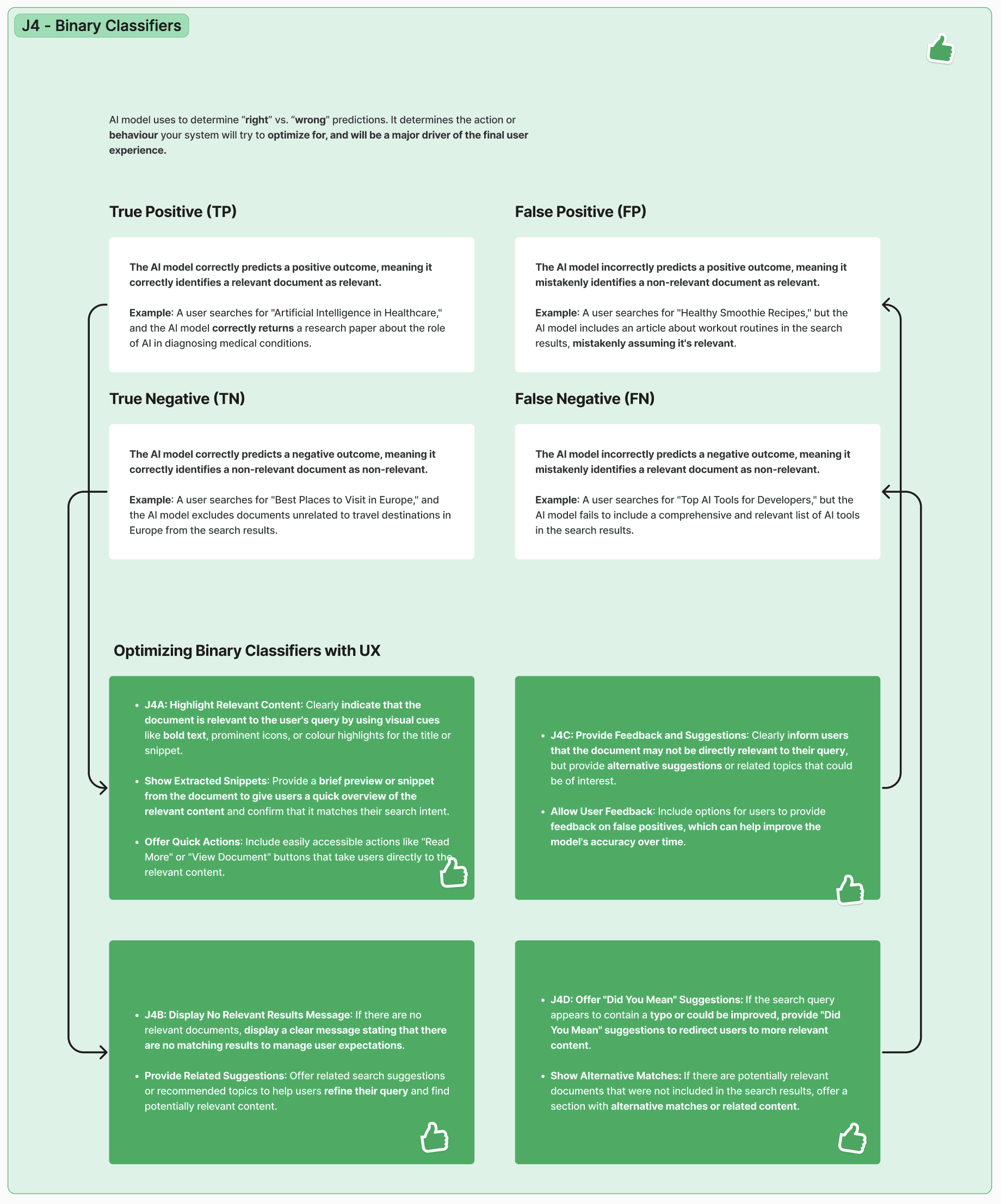
J4 translates classifier outcomes into design decisions. Every search result is a prediction, whether true positive, false positive, true negative, or false negative, and each failure mode gets its own UX answer: highlight and preview clearly relevant results, state plainly when nothing matches, offer feedback paths and related suggestions when the system overreaches, and surface “did you mean” and alternative matches when it misses. Designing for the error states, not just the happy path, is what makes AI search feel trustworthy.
J5 · Precision & Recall Tradeoffs
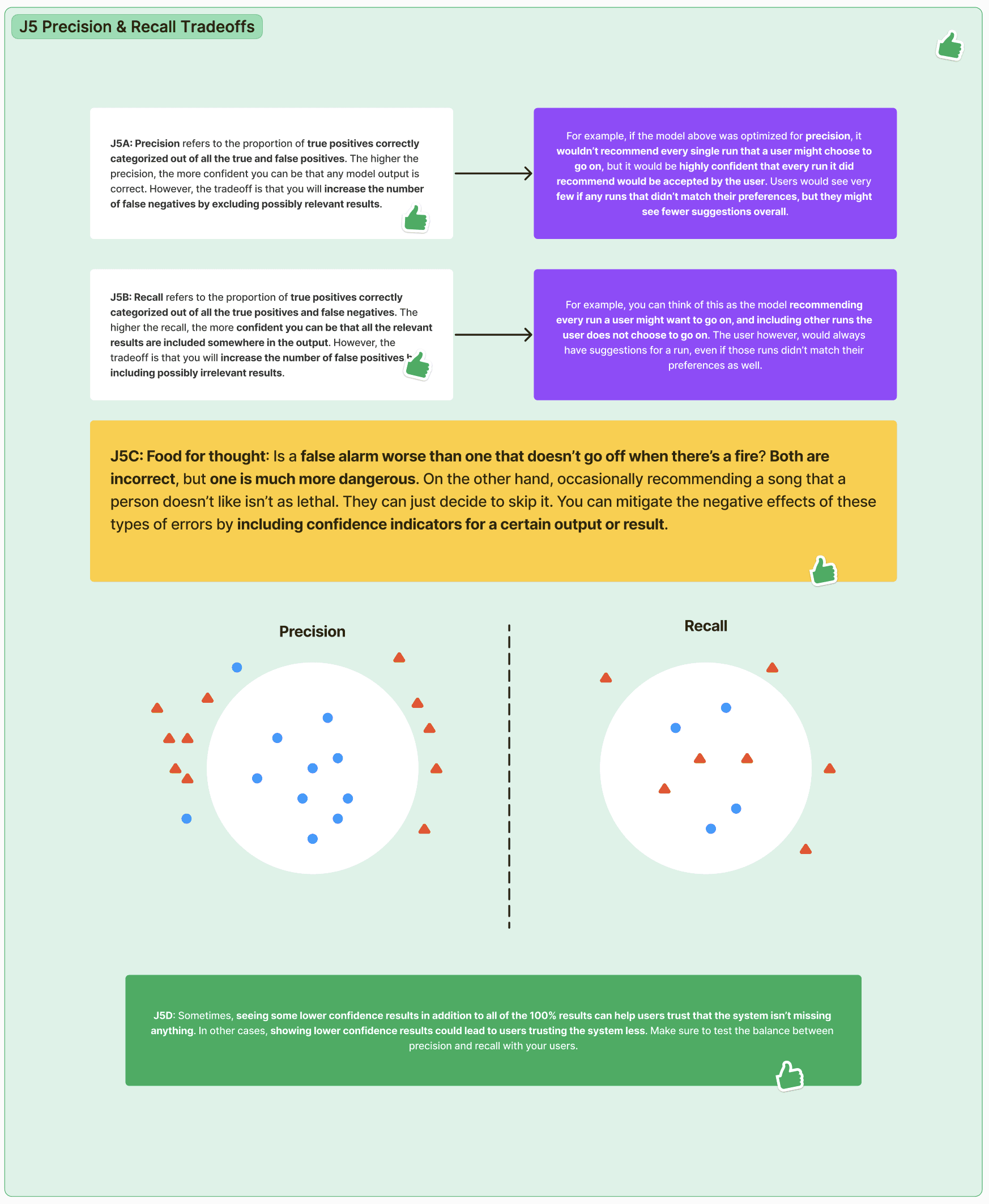
J5 makes the central tuning decision visible. Precision means everything shown is relevant, at the cost of missing things; recall means nothing relevant is missed, at the cost of noise. The framing question turns an abstract metric into a product judgment: is a false alarm worse than the alarm that never goes off? It's also why the design surfaces confidence indicators: showing lower-confidence results builds trust in some contexts and erodes it in others, so the balance has to be tested with users, not assumed.
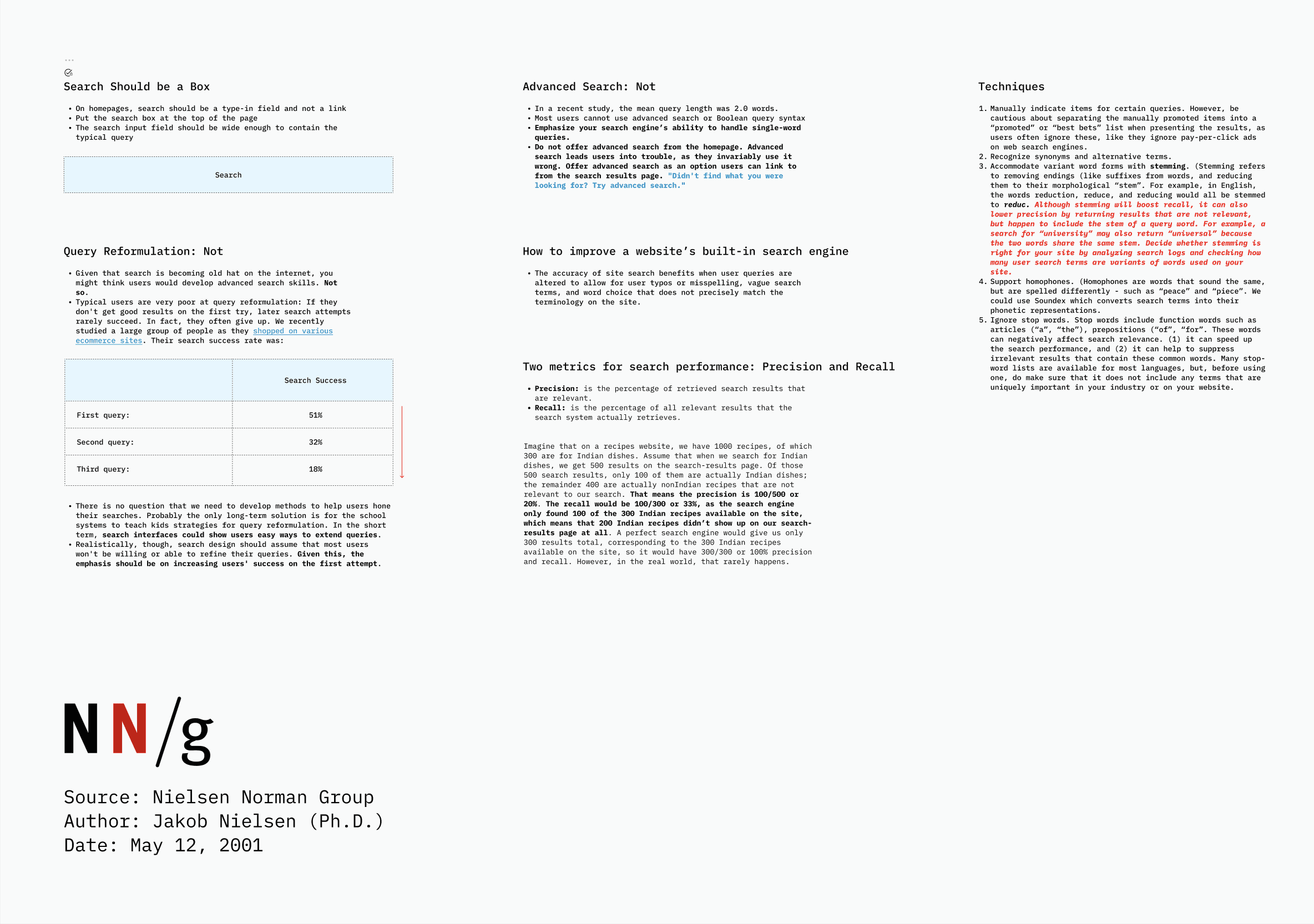
A synthesis of Jakob Nielsen's research on how people actually search. The numbers shaped everything: queries average two words, success falls from 51% to 32% to 18% across successive attempts, and users almost never master advanced syntax, so the design has to win on the first try. It's also where the working definitions of precision and recall, and techniques like stemming and typo tolerance, entered the team's shared vocabulary.
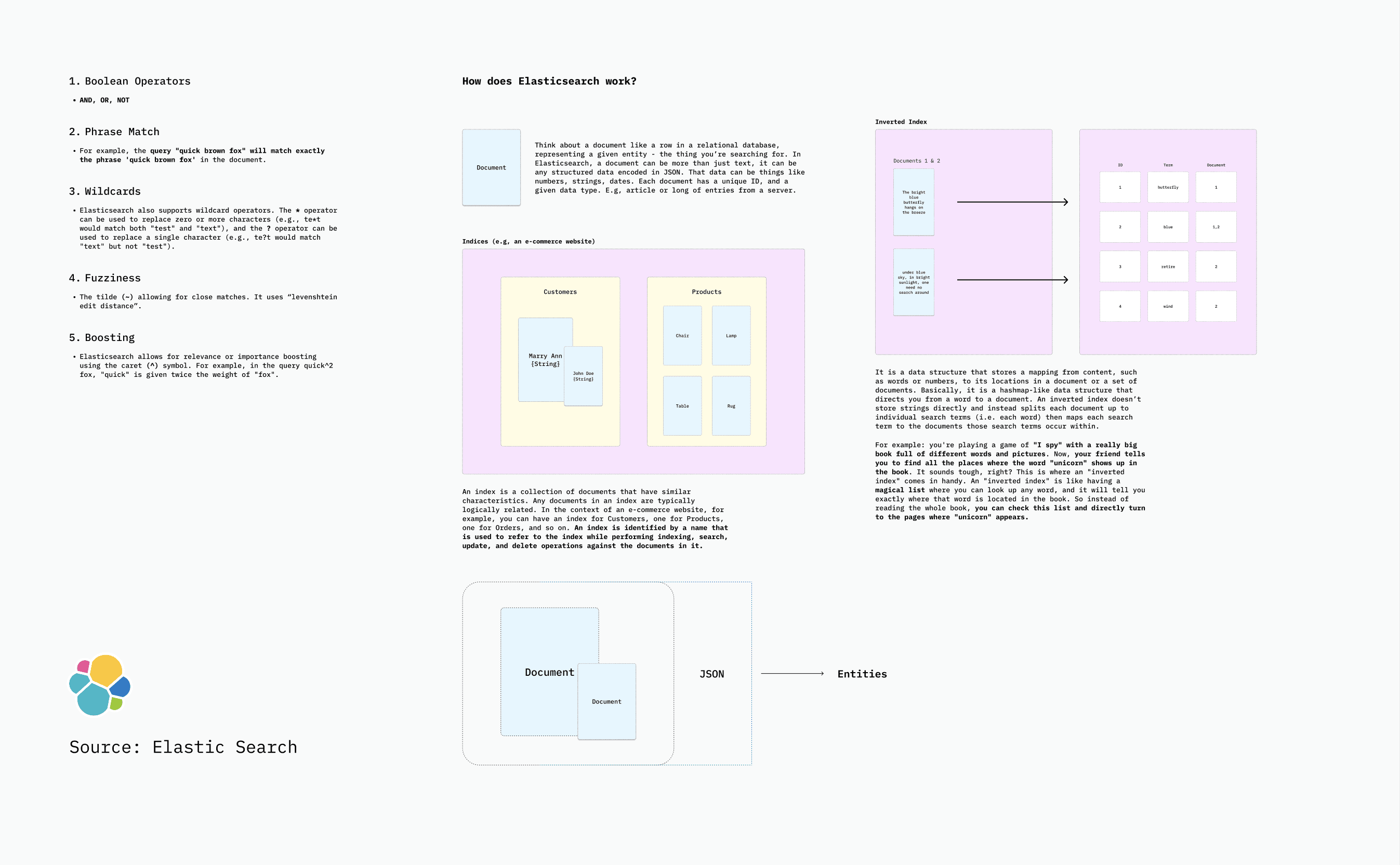
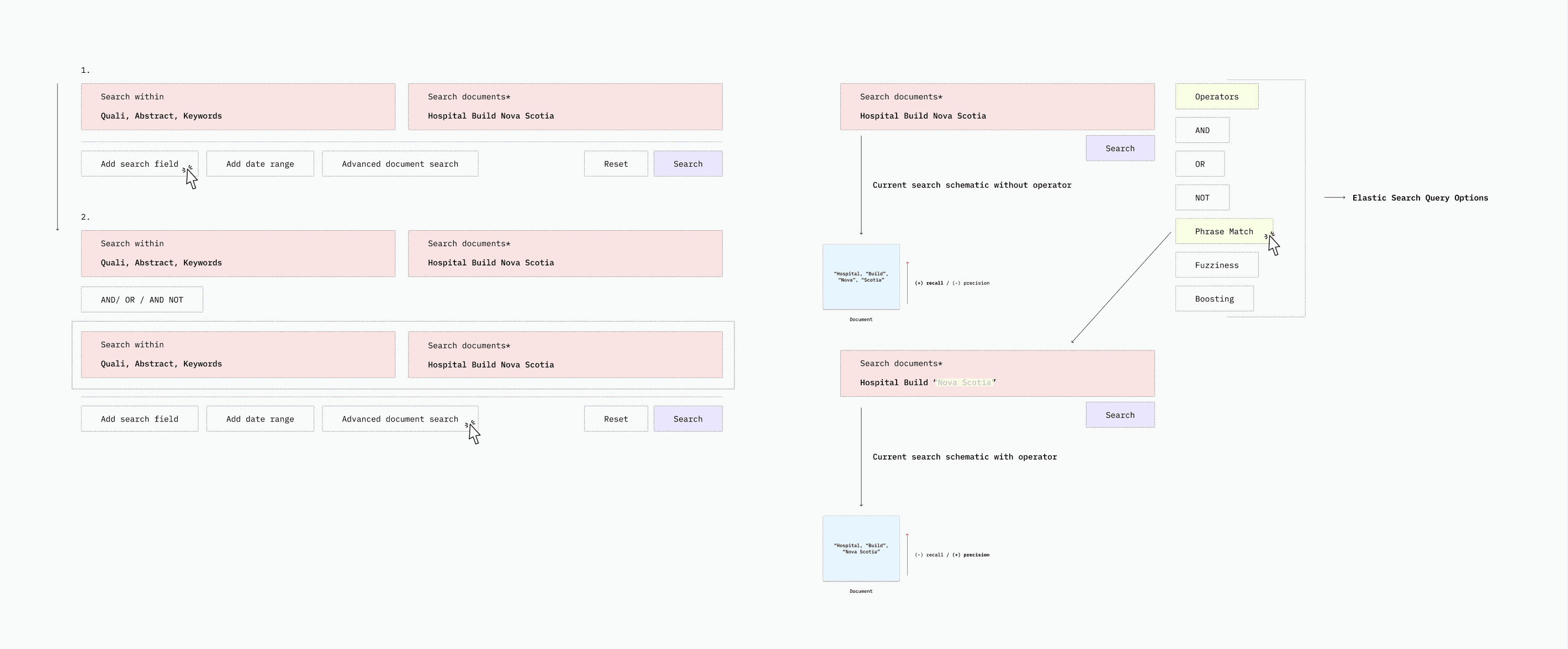
KX search runs on Elasticsearch, so I documented how the engine actually retrieves, covering documents, indices, and the inverted index, alongside the query capabilities the interface could expose: boolean operators, phrase matching, wildcards, fuzziness, boosting. You can't design honest search controls without knowing exactly what the engine can and cannot do.
The translation layer between engine and interface: schematics showing where each Elasticsearch capability surfaces in the search bar, filters, and suggestions a consultant actually touches. This is where J4's theory, the engine's mechanics, and the final screens meet.
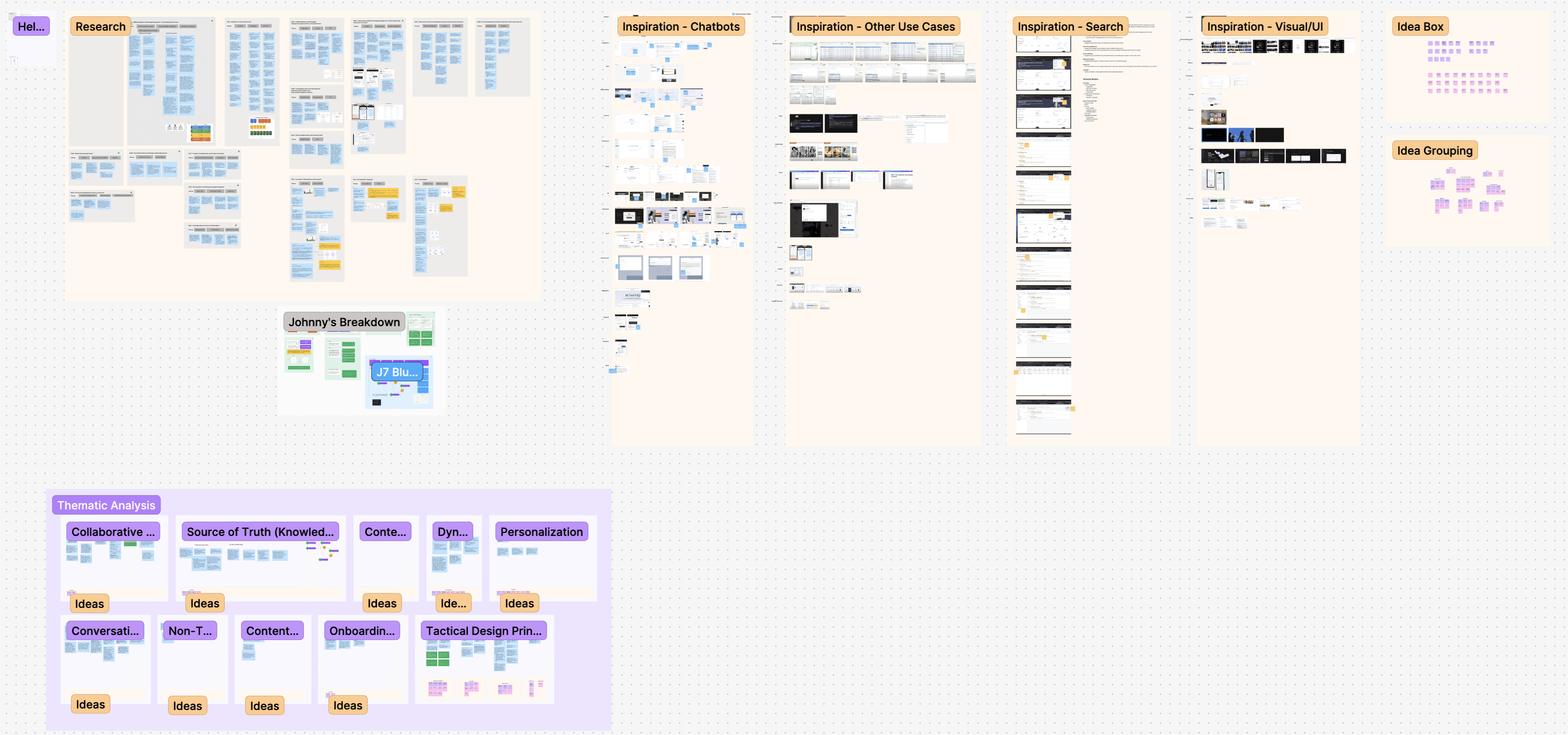
The full ideation sweep: competitive inspiration across chatbots, enterprise search, and visual patterns, distilled through thematic analysis into the directions that mattered: knowledge as a source of truth, personalization, conversational and non-traditional search, onboarding. The idea box and groupings show the field of options before it narrowed.
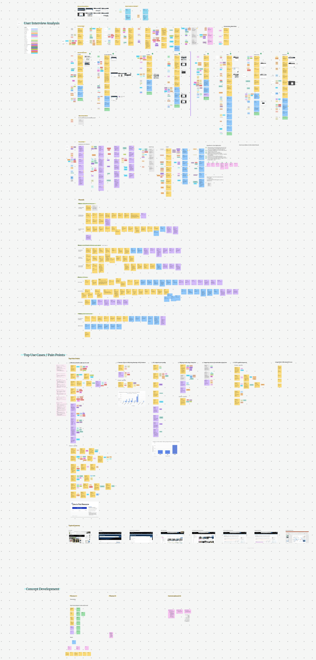
Where it all started: user interviews clustered into pain points, ranked into top use cases, and developed into the first concepts. The through-line from what Deloitte's practitioners said to what the InfoCenter became runs straight through this board.
These artifacts helped bridge communication gaps between technical, design, and business stakeholders, ensuring all parties understood the rationale behind our design decisions.
Professional Growth and Impact
This project represented a significant professional milestone, allowing me to apply design thinking to complex enterprise information systems while navigating the technical intricacies of AI implementation. The experience enhanced my capabilities in:
Enterprise research
Conducting rigorous user research in enterprise environments.
AI translation
Translating technical AI concepts into human-centered designs.
Stakeholder alignment
Balancing competing stakeholder priorities across global organizations.
Design education
Creating educational materials that build understanding across disciplines.
Human-centered systems
Designing systems that enhance rather than replace human expertise.
While confidentiality agreements prevent sharing the specific implementations developed for this client, the conceptual frameworks and design principles I created continue to inform my approach to complex information systems and AI-assisted user experiences.
 Figma
Figma